


Introduction
The OECD AI Policy Observatory (OECD.AI) aims to help countries encourage, nurture and monitor the responsible development of trustworthy artificial intelligence (AI) systems for the benefit of society. As an inclusive online platform for public policy on AI, the Observatory provides a comprehensive database of AI policies from across the world. Building on the momentum of the OECD’s Recommendation on Artificial Intelligence, the first intergovernmental standard on AI, the Observatory combines resources from across the OECD with those of partners from all stakeholder groups to facilitate dialogue and provide multidisciplinary, evidence-based policy analysis on AI.
The “Trends & data” section of OECD.AI aims to help policy makers develop, implement and improve policies for AI. To do so, OECD.AI showcases data and metrics to allow countries and stakeholders to compare policy responses, engage in international co-operation, monitor progress and develop best practices.
The “Data from partners” subsection provides data from partner institutions, with the objective of showing AI-related trends over time from as many high quality sources and vantage points as possible.
The present note aims at providing a full and transparent account of the sources and methodology used to construct the “Data from partners” visualisations for OECD.AI. It covers data provided by the following partners:
- Microsoft Academic Graph
- Event Registry
- Coursera
- Google Trends
- GitHub
- Scopus
- Adzuna
- Preqin
OECD.AI visualisations using data from these data sources were developed by the AI Lab at the Slovenian Jožef Stefan Institute (JSI). Data sources and methodologies in OECD.AI may differ from those previously used for OECD research, and therefore results may vary. Because methods for measuring AI are still evolving, there remain definitional and other issues that can influence empirical results. Efforts to develop clear definitions, taxonomies and classifications are underway, as are efforts to compile accurate and comparable indicators. Given the current evolving situation, showing trends in a timely manner based on transparent methodologies by partner institutions can be of value to policy makers.
1 Microsoft Academic Graph data
The Microsoft Academic Graph (MAG) is a heterogeneous graph containing scientific publication records, citation relationships between those publications, as well as authors, institutions, journals, conferences, and fields of study (Sinha et al., 2015; Wang et al., 2019).
MAG employs advances in machine learning, semantic inference and knowledge discovery to explore scholarly information. It is a semantic search engine (i.e. not keyword-based), which means that it employs natural language processing (NLP) to understand and remember the knowledge conveyed in each document.
Information is indexed by paper type, author, time of publication, field of study, publication outlet and institution. The graph is updated on a bi-weekly basis. In 2019, close to one million new papers were added every month (Wang, 2019).
Each paper is automatically categorised into a field of study following a machine-learned taxonomy. An algorithm detects the concepts present in each paper and identifies, or “learns”, the hierarchy of different fields of studies. This concept detection operation is performed bi-weekly every time the graph (In discrete mathematics, graphs are mathematical structures used to model pairwise relations between objects. Graphs are made up of vertices, also called nodes or points, which are connected by edges, also called links or lines) is updated and applied to every new article, which is tagged accordingly. The taxonomy itself is adjusted every 6 months. Because top-level disciplines are important and visible, the top two levels of the taxonomy are manually reviewed against Wikipedia’s hierarchy of topic classifications (Shen et al., 2018).
Determining Artificial Intelligence papers for OECD.AI
The visualisations provided in the OECD AI Policy Observatory (OECD.AI) use a subset of the MAG comprised of papers related to AI. A paper is considered to be about AI if it is tagged during the concept detection operation with a field of study that is categorised in either the “artificial intelligence” or the “machine learning” fields of study in the MAG taxonomy. Results from other fields of study, such as “natural language processing”, “speech recognition”, and “computer vision” are only included if they also belong to the “artificial intelligence” or the “machine learning” fields of study. As such, the results are likely to be conservative.
Collaboration between countries or institutions
OECD.AI displays research collaborations between different entities, either institutions or countries (Country names and codes in OECD.AI abide by the “OECD Guidelines regarding the use of the list of names of countries and territories.” ). This is done by assigning each paper to the relevant institutions and countries on the basis of the authors’ institutional affiliations (Information about an author’s institutional affiliations is available for about 51% of AI publications in MAG. Thus, collaboration statistics may be underestimated). OECD and CSIC (2016) define collaboration as “co-authorship involving different institutions. International collaboration refers to publications co-authored among institutions in different countries…National collaboration concerns publications co-authored by different institutions within the reference country. No collaboration refers to publications not involving co-authorship across institutions. No collaboration includes singled-authored articles, as long as the individual has a single affiliation, as well as multiple-authored documents within a given institution.” Institutional measures of collaboration may overestimate actual collaboration in the case of countries where it is common practice to have a double affiliation (OECD and CSIC, 2016).
To avoid double counting, collaborations are considered to be binary: either an entity collaborates on a paper (value=1) or it does not (value=0). The shared paper counts as one toward the number of collaborations between two entities. The following rules apply:
- For between-country collaborations: papers written by authors from more than one institution in the same country only count as one collaboration for that country.
- For between-institution collaboration: papers written by more than one author from the same institution only count as one collaboration for that institution.
Matching institutions to their countries
The Global Research Identifier Database (GRID) was used to match institutions in MAG to a country. Information about an institution’s geographical coordinates, city, and country from GRID allowed for the geolocation of 72% of the institutions in MAG. The remaining institutions were matched manually to their respective countries.
An artificial entity called “international organisations” was created to reflect papers written by international organisations. This avoids counting these papers as originating in the country where the relevant international organisation is headquartered.
Following the same logic, papers from multinational enterprises were attributed to the country in which the company’s headquarters are located, regardless of the country in which the actual research was conducted.
Moreover, information from GRID was used to classify institutions by type, including company, education, government, healthcare, archive, facility, non-profit and others. Heuristics were defined to classify institutions for which this information was missing in GRID. Where heuristics did not work, institution types were input manually.
Type of papers
The MAG classifies papers into the following types depending on publication outlets: conference; book; book chapter; repository; patents; journal; and other. The “Repository” type refers to archival sites, including arXiv, bioRxiv, and SSRN. There may be several versions of “Repository” papers, including some that may be published in conventional journals. “Other” is a category comprising papers from journals or conferences of which the quality is unknown. This includes one-off workshops, new journals, or venues that no longer exist.
Arguably, patents are conceptually different from the other categories in this listing (MAG includes patent applications as publications since they “fit well into the model of publication entity…because they all have authors, affiliations, topical contents, etc., and can receive citations” [Wang et al., 2019]). Therefore, for simplicity, the category “Research publications” – the default setting for most MAG data visualisations on OECD.AI – comprises all paper types except patents. The drop-down menu “Publication type” allows selecting and viewing results for patents only (Note that results for patents come with some considerable lag, as “publication [of a patent] generally only takes place 18 months after the first filing. As a result, patent data are publicly available for most countries across the world, often in long time series” [OECD, 2009]).
10 Saliency rankings differ from traditional citation counts in that the latter treat each citation as equal and perpetual, whereas the earlier imposes weighting on each citation based on the factors mentioned above. While citation counts could be altered with relative ease, to boost the saliency of an article one would have to persuade many well-established authors publishing at reputable venues to cite it frequently.
Counting of publications: quantity measure
In absolute terms, each publication counts as one unit towards an entity (a country or an institution). To avoid double-counting, a publication written by multiple authors from different institutions is split equally among each author. For example, if a publication has four authors from institutions in the US, one author from an institution in China and one author from a French institution, then 4/6 are attributed to the US, 1/6 to China and 1/6 to France. The same logic applies to institutional collaborations.
The “Publications per capita” checkbox allows the user to normalise the number of publications per unit of population for countries with a population of at least one million.
Counting of publications: quality measure
MAG assigns a rank to each publication to indicate its relevance (Since papers may be published in different formats and venues, in some cases different versions of the same paper exist in MAG. These papers are grouped under a unique identifier called “family ID”, that borrows the value or “paper ID” of the main paper in the family. MAG ranks its publications by family ID). Since papers may be published in different formats and venues, in some cases different versions of the same paper exist in MAG. These papers are grouped under a unique identifier called “family ID”, which borrows the value or “paper ID” of the main paper in the family. MAG ranks its publications by family ID. It does so by using a dynamic eigencentrality measure that ranks a publication highly if that publication impacts highly ranked publications, is authored by highly ranked scholars from reputable institutions, or is published in a highly regarded venue and also considers the competitiveness of the field. The eigencentrality measure can be considered as the likelihood that a publication would be evaluated as being highly impactful if a survey were to be posed to the entire scholarly community. For this reason, MAG calls this measure the “saliency” of the publication. Saliency rankings differ from traditional citation counts in that the latter treat each citation as equal and perpetual, whereas the earlier imposes weighting on each citation based on the factors mentioned above. While citation counts could be altered with relative ease, to boost the saliency of an article one would have to persuade many well-established authors publishing at reputable venues to cite it frequently. Similarly, the saliency of an author, institution, field, and publication venue represents the sum of all saliencies of the respective publications.
To adjust for temporal bias – i.e. older publications having more citations than more recent ones because they have been in circulation longer – MAG considers that saliency is an autoregressive stochastic process. This means that the saliency of a publication decays over time if a publication does not receive continuing acknowledgments, or its authors, publication venue and fields do not maintain their saliency levels. Reinforcement learning is used to estimate the rate of the decay and to adapt the saliency to best predict future citation behaviours. By leveraging the scale of Microsoft’s web crawler in Bing, MAG observes tens of millions of citations each week, which serve as feedback from the entire scholarly community on its saliency assessments. Find out more about how publications are ranked in MAG.
OECD.AI uses the saliency rankings from MAG as a measure of quality. To provide fairer intertemporal comparisons, publication ranks are normalised according to the publication year.
OECD AI Principles
Classification of scientific publications by AI Principle
A pool-based active learning algorithm (Active learning is a type of iterative supervised learning that interactively queries the user to obtain the desired labels for new data points. By choosing the data from which it learns, an active learning algorithm is designed to achieve greater accuracy with fewer training labels than in traditional supervised learning [Settles, 2010])was developed and trained to classify publications under each of the OECD AI Principles “AI Principles” (Please see OECD [2019a] for more information about the OECD AI Principles). A subset of the AI publications in MAG was selected to train the active learning algorithm. This was accomplished by estimating a semantic similarity score between a publication’s title and abstract, and information on each of the AI Principles from the following resources:
- OECD Recommendation of the Council on Artificial Intelligence (OECD, 2019a).
- Practical implementation guidance for the OECD AI principles (OECD, 2019b).
- List of keywords purposely created for each AI Principle, assigning a specific relevance level to each term (i.e., either high or standard relevance).
A similarity score was determined using the following methodology:
- A “count score” was calculated by counting the total number of high relevance and standard relevance keywords in a publication’s keywords, abstract and title using the following formula:
- Count score = (count of high relevance keywords) + 0.3*(count of standard relevance keywords)
- A “cosine similarity score” was calculated between the publications and the three abovementioned resources using the following formula:
- Cosine similarity score = (cosine similarity between publications and the list of keywords for each AI Principle) + (cosine similarity between publications and each AI Principle’s section from the practical implementation guidance)
- The similarity score is defined as the sum of the count and the cosine similarity scores:
- Similarity score = (Count score) + (Cosine similarity score)
The 10 000 publications with the highest similarity score were included in the training dataset for each AI Principle. Training and refinement of the active learning classifier is expected to continue throughout 2020.
Selection of related recent scientific research by AI Principle
After using the active learning classifier to identify publications relevant to each of the AI Principles, publications are sorted based on their MAG saliency rank. The highest-ranking publications from the last six months are then selected to be shown in the OECD.AI platform.
Policy areas
Classification of scientific publications by policy area
A list of the most relevant fields of study from the MAG taxonomy was created for each policy area. Policy areas include agriculture, competition, corporate governance, development, digital economy, economy, education, employment, environment, finance and insurance, health, industry and entrepreneurship, innovation, investment, public governance, science and technology, social and welfare issues, tax, trade, and transport. An AI-related publication from MAG must contain at least one of the relevant MAG topics for a given policy area to be classified in that policy area.
Selection of related recent scientific research by policy area
For each policy area, relevant AI-related publications are sorted based on their MAG saliency rank. The highest-ranking publications in the last six months were then selected to be shown in the OECD.AI platform.
Additional metrics
Additional metrics are used to construct the y-axis of the “AI publications vs GDP per capita by country, region, in time” chart. These indicators include:
- GDP: GDP at purchaser’s prices is the sum of gross value added by all resident producers in the economy plus any product taxes and minus any subsidies not included in the value of the products. It is calculated without deducting the depreciation of fabricated assets or the depletion and degradation of natural resources. Data are in current US dollars. Dollar figures for GDP are converted from domestic currencies using single year official exchange rates. For a few countries where the official exchange rate does not reflect the rate effectively applied to actual foreign exchange transactions, an alternative conversion factor is used. Sources: World Bank national accounts data and OECD National Accounts data files (data.worldbank.org/).
- GDP per capita: GDP per capita is gross domestic product divided by midyear population. GDP is the sum of gross value added by all resident producers in the economy plus any product taxes and minus any subsidies not included in the value of the products. It is calculated without making deductions for depreciation of fabricated assets or for depletion and degradation of natural resources. Data are in current U.S. dollars. Sources: World Bank national accounts data and OECD National Accounts data files (data.worldbank.org/).
- Population: Total population is based on the de facto definition of population, which counts all residents regardless of legal status or citizenship. The values shown are midyear estimates. Sources: United Nations Population Division, World Population Prospects: 2019 Revision; Census reports and other statistical publications from national statistical offices; Eurostat: Demographic Statistics; United Nations Statistical Division, Population and Vital Statistics Report; U.S. Census Bureau: International Database; and Secretariat of the Pacific Community: Statistics and Demography Programme (data.worldbank.org/).
- R&D expenditure (% of GDP): Gross domestic expenditures on research and development (R&D), expressed as a percent of GDP. They include both capital and current expenditures in the four main sectors: Business enterprise, Government, Higher education and Private non-profit. R&D covers basic research, applied research, and experimental development. Source: UNESCO Institute for Statistics (uis.unesco.org).
For these metrics, data is interpolated in years where no data is available. If last year’s value is missing for an indicator, the value of the latest available year is used.
COVID-19 research
The visualisations included under the “COVID-19 research” tab use MAG data and follow a similar methodology to the one described for AI research (see sections Determining Artificial Intelligence papers for OECD.AI, Collaboration between countries or institutions, Matching institutions to their countries, Type of papers, Counting of publications: quantity measure, and Counting of publications: quality measure).
Contrastingly to AI, a paper is considered to be related to Coronavirus if it is tagged during the concept detection operation with any of the below fields of study – or their sub-concepts – from the MAG taxonomy:
- Coronavirus
- Coronavirus disease 2019 (COVID-19)
- Severe acute respiratory syndrome
- Middle East respiratory syndrome coronavirus
2 LinkedIn data
Skills
LinkedIn members self-report their skills on their LinkedIn profiles. Currently, more than 35 000 distinct, standardised skills are identified by LinkedIn (These have been coded and classified by taxonomists at LinkedIn into 249 skill groupings, which are the skill groups represented in the dataset. LinkedIn continuously works on improving methodologies and taxonomies. LinkedIn and the OECD plan to work closely to update this information as the methodology and information evolve). The top skills that comprise the AI skill grouping are Machine Learning, Natural Language Processing, Data Structures, Artificial Intelligence, Computer Vision, Image Processing, Deep Learning, TensorFlow, Pandas (software) and OpenCV, among others.
Skill groupings are derived through a similarity index that measures skill composition at the industry level. Industries are classified according to the ISIC 4 industry classification (Zhu et al., 2018).
Countries included in the dataset are a select sample of eligible countries with 100 000 LinkedIn members or more, a LinkedIn labour force coverage of at least 40% and at least 10 AI hires in any given month throughout the selected time period. For this reason, country samples for AI penetration by industry and gender are more restricted. China, Germany and India were included in this sample due to their relevance in the global economy, but LinkedIn coverage in these countries does not reach 40% of the workforce. Insights for these countries may not provide as full a picture as for other countries, and should be interpreted accordingly.
AI skills penetration
The aim of this indicator is to measure the intensity of AI skills in an entity (country, industry, gender, etc.) through the following methodology:
- Computing frequencies for all self-added skills by LinkedIn members in a given entity (occupation, industry, etc.) in 2015-2020.
- Re-weighting skill frequencies using a TF-IDF (In information retrieval, tf–idf or TFIDF, short for term frequency–inverse document frequency, is a numerical statistic that is intended to reflect how important a word is to a document in a collection or corpus (Rajaraman and Ullman, 2011). The tf–idf value increases proportionally to the number of times a word appears in the document and is offset by the number of documents in the corpus that contain the word, which helps to adjust for the fact that some words appear more frequently in general [Breitinger, Gipp, and Langer, 2015].) model to get the top 50 most representative skills in that entity. These 50 skills compose the “skill genome” of that entity.
- Computing the share of skills that belong to the AI skill group out of the top skills in the selected entity.
The AI skill penetration rate signals the prevalence of AI skills across occupations. For example, the top 50 skills for the occupation of “Engineer” are calculated based on the weighted frequency with which they appear in LinkedIn members’ profiles. If four of these skills that engineers possess belong to the AI skill group, then this measure indicates that the penetration of AI skills is estimated to be 8% among engineers (i.e. 4/50).
To allow for skills penetration comparisons across countries, the skills genomes are calculated and a relevant benchmark is selected (e.g. OECD or G20 average). The benchmarks are constructed by pooling LinkedIn members from all countries in the sample and averaging skills penetration among them; therefore, benchmark values are not an average of all countries’ averages. A ratio is then constructed between a country’s and the benchmark’s AI skills penetrations, controlling for occupations. For instance, a country’s relative AI skills penetration of 1.5 indicates that AI skills are 1.5 times as frequent as in the benchmark, for an overlapping set of occupations.
AI skills penetration by country and industry
The relative AI skills penetration by country and industry provides in-depth sectoral decomposition of AI skill penetration across industries in selected countries. For instance, India has the highest relative AI skill penetration across all five industries while the United States and China frequently appear high up on the list.
To illustrate, a country’s relative AI skill penetration rate of 2 in the Education sector means that the average penetration of AI skills in that country is 2 times the average AI skill penetration in the Education sector of the selected countries across the same set of occupations.
AI skills penetration by gender
The relative AI skill penetration by country and gender provides in-depth decomposition of AI skills penetration across female and male labour pools in selected countries.
For example, a country’s relative AI skill penetration rate for women equal to 2 means that the average penetration of AI skills among women in that country is 2 times the average for women in the selected countries across the same set of occupations.
AI skills penetration: country rankings over time
This chart features the ranking of AI skills penetration over time, from 2016 to 2020. The ranking is calculated by estimating the ratio between a country’s AI skills penetration and the average AI skills penetration of all countries in the sample, controlling for occupations. The countries are filtered based on their last year’s value.
AI skills migration
Data on AI skills migration comes from the World Bank Group – LinkedIn “Digital Data for Development” partnership (please see https://linkedindata.worldbank.org/ and Zhu et al. [2018]).
LinkedIn migration rates are derived from the self-identified locations of LinkedIn member profiles. For example, when a LinkedIn member updates his or her location from Paris to London, this is counted as a migration LinkedIn migration rates for 2015 were compared with international migration flow data from the OECD, finding that LinkedIn covered roughly 21.4% of all migration flows in the OECD dataset. Coverage is best for migration of skilled workers between high-income countries.
LinkedIn data provide insights to countries on the skills gained or lost due to migration trends. Skill migration is considered for skills at time t for country A as the country of interest and country B as the source of inflows and destination for outflows. Thus, net skill migration between country A and country B – for country A – is calculated as follows:
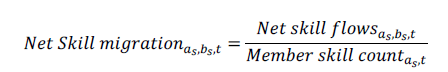
Net flows are defined as total arrivals minus departures within the given time period. LinkedIn membership varies considerably between countries, which makes interpreting absolute movements of members from one country to another difficult. To compare migration flows between countries fairly, migration flows are normalised for the country of interest. For example, if country A is the country of interest, all absolute net flows into and out of country A, regardless of origin and destination countries, are normalised based on LinkedIn membership in country A at the end of each year and multiplied by 10 000. Hence, this metric indicates relative talent migration from all countries to and from country A.
To protect LinkedIn member privacy, a minimum threshold of 50 LinkedIn members meeting the criteria being queried is required for the results to be shown on OECD.AI (i.e. gross migration of at least 50 members in each skill group every year).
AI hiring over time
The AI hiring over time chart on OECD.AI indicates the rate of hiring in the AI field for each country. The LinkedIn AI hiring rate is calculated as the total number of LinkedIn members who have AI skills on their profile and added a new employer in the same month the new job began, divided by the total number of LinkedIn members in the country. Analysing the timeliest data makes month-to-month comparisons possible.
The AI hiring rate is indexed against the average annual hiring in 2016; for example, an index of 3.5 for Brazil in 2020 indicates that the AI hiring rate is 3.5 times higher in 2020 than the average in 2016. A 12-month moving average is used to smoothen the curve.
Top AI skills worldwide
This chart displays the top (most prevalent) AI Skills in global LinkedIn member profiles for the period 2015-2020.
Fastest growing AI skills
This chart displays the top 10 fastest growing AI skills (year-over-year growth rates) in global LinkedIn member profiles.
3 Event Registry data
Classification of AI news by AI Principle and policy area
A list of keywords was created for each AI Principle and policy area by selecting the most relevant related concepts in Event Registry’s search engine. To be classified under a certain AI Principle or policy area, a news article must a) be related to AI, and b) contain at least one of the concepts specified for that AI Principle or policy area in its title and/or abstract.
Selection of related online news by AI Principle and policy area
The most relevant news events from the past six months are shown in the “Related online news from Event Registry” lists in both AI Principle and policy areas dashboards. A news “event” is defined as a collection of news articles covering the same news. It serves as a measure of news impact.
News sentiment analysis
A ‘sentiment’ score is assigned to each news article and event to determine whether an article or event is ‘positive’, ‘neutral’, or ‘negative’. The sentiment score is calculated using the “VADER” (Valence Aware Dictionary and sEntiment Reasoner) open-source service, “a lexicon and rule-based sentiment analysis tool that is specifically attuned to sentiments expressed in social media.”
VADER contains a lexicon of words for which a sentiment score has been computed. The sentiment score is a floating value between -1 (negative) and 1 (positive). Additionally, VADER contains a set of rules to determine how sentiment is emphasised with individual words (for instance, “very” emphasises the sentiment, while negations inverse it). The sentiment score of an article results from the analysis of the first five sentences of the article. In practice, news articles rarely have extreme values close to 1 and -1; thus, scores below -0.1 are classified as negative; between -0.1 and 0.1 as neutral; and above 0.1 as positive.
4 Coursera data
Online learning has the potential to provide access to education in a wide range of topics to a large population around the globe. Coursera, an online platform for higher education, serves over 65 million learners around the world by providing access to educational content from leading universities and companies. The scale of the platform, which includes more than 4 300 courses, over 400 specialisations and 20 degrees, creates one of the largest skills databases in the world.
The Coursera Global Skills Index (GSI) 2019 draws upon Coursera’s rich data to benchmark 60 countries and 10 industries across business, technology, and data science skills to reveal skill development trends around the world. Coursera measures the skill proficiency of countries in AI and related skills, including math, machine learning, statistics, statistical programming, and software engineering. Arguably, these related skills cover many important elements needed to build and deploy AI powered technologies within organisations and society.
The visualisation on OECD.AI provides a relative ranking of countries based on their AI-related skills. It was built using Coursera’s GSI 2019 data, made available at Stanford’s Human AI Index website (For technical details on how the percentiles were constructed, please refer to the technical annex of Stanford’s Human AI Index report). Percentiles are normalised by AI-related skill. When more than one skill is selected, the corresponding percentiles are stacked on top of each other. As such, the total height of the bar represents the sum of all percentiles for the selected skills in a given country.
5 Google Trends Data
Google Trends provides access to a largely unfiltered sample of search queries made to Google, anonymised, categorised (according to the topic of the search query) and aggregated. As such, Google Trends data allow to measure public interest in a topic and the evolution of that interest across time and geographies. Google Trends provides data from 2004 onwards.
For any given keyword, the Google API provides a list of 25 other keywords that are most often searched in association with it, based on correlational analysis. In turn, for each of the terms on that list, the same list of top 25 associated search terms can be retrieved.
Three visualisations have been constructed on OECD.AI using Google Trends data: Top AI-related Google search queries by country and in time; international search trends; and domestic trends per topic.
Top AI-related Google search queries by country and in time
The “Top AI-related Google search queries by country and in time” network chart shows the associations made between different AI-related keywords in search queries submitted to Google and how these evolve over time, by country.
The central (red) node in the network chart shows the topic for which the associations are mapped out (e.g. the “selected topic”). All other nodes linked to this central node represent its most commonly associated key terms.
The colours of each node describe the relative novelty of the term associated to it:
- A green node signals that the topic has only started appearing among the top associated topics for the selected term over the period considered, and did not figure among the top associations beforehand.
- A blue node signals that the topic was already on the list of top associated topics to the selected term retrieved for the previous period.
“Artificial Intelligence” is by default the select topic. The user can select other topics to be at the centre of the graph by clicking on them.
The reference time period is equivalent to one month: the graph shows the list of 25 key words that were most often searched for in association with the central keyword over a given month. The user can the top “Date” bar to move at monthly intervals.
The chart is currently available for all months since January 2015, for all OECD and G20 member countries. Going forward, more countries and time periods will be added.
International search trends
The “International search trends” chart compares interest in a given AI-related topic by country and over time.
The drop-down menu includes all topics correlated to “Artificial intelligence” with a correlation coefficient of at least 0.5. The list of topics is ranked according to a topic’s frequency of appearance over time, starting with the most frequently correlated topics to “Artificial Intelligence”. For instance, a topic correlated to “Artificial Intelligence” with a coefficient of at least 0.5 for 10 months would rank higher than a topic meeting the same correlation criteria for a 5-month period.
Country time series are normalised per country and time range. Therefore, relative comparisons between countries are not valid. Data are indexed to 100, where 100 is the maximum search interest in a particular topic for the time range and country selected. This implies that interest for a given topic is expressed as a proportion of all searches on all topics on Google over a specific time period and geography. This is important as the number of people searching on Google changes constantly as digitalisation progresses.
Currently, data is available from 2004 for OECD and G20 countries. Going forward, more countries will be added.
Domestic trends per topic
The “Domestic trends per topic” chart compares interest in one or more AI-related topics in a given country over time.
The drop-down menu includes all topics correlated to “Artificial intelligence” with a correlation coefficient of at least 0.5. The list of topics is ranked according to a topic’s frequency of appearance over time, starting with the most frequently correlated topics to “Artificial Intelligence”. For instance, a topic correlated to “Artificial Intelligence” with a coefficient of at least 0.5 for 10 months would rank higher than a topic meeting the same correlation criteria for a 5-month period.
Time series are normalised per country and time range. Therefore, relative comparisons between topics are not valid. Data are indexed to 100, where 100 is the maximum search interest in a particular topic for the time range and country selected. This implies that interest for a given topic is expressed as a proportion of all searches on all topics on Google over a specific time period and geography. This is important as the number of people searching on Google changes constantly as digitalisation progresses.
Currently, data is available from 2004 for OECD and G20 countries. Going forward, more countries will be added.
6 GitHub data
Since its creation in 2007, GitHub has become the main provider of Internet hosting for software development and version control. Many technology organisations and software developers use GitHub as a primary place for collaboration.
To enable collaboration, GitHub is structured into repositories, which contain all of a project’s files and each file’s revision history. Based on their content, GitHub repositories are tagged with particular topic labels. The topics are suggested automatically by GitHub and need to be confirmed by the users of the repository. As such, the analysis of GitHub data could shed light on relevant metrics about how code is being developed and on what topics, as proxies for broader trends in the field of software development and innovation.
A significant portion of AI development takes place on GitHub. OECD.AI partners with GitHub to identify public AI repositories, following the methodology developed by Gonzalez et al. (2020). Using the 439 topic labels identified by Gonzalez et al. – as well as the topics “machine learning”, “deep learning”, and “artificial intelligence” – GitHub provided OECD.AI with a list of over 500 000 public repositories of AI code. In turn, OECD.AI uses this list to query GitHub’s API and obtain more information about these repositories. For data visualisations on OECD.AI to be able to capture trends in AI software development over time, GitHub is updating the list of public AI repositories on a quarterly basis.
So far, the data visualisations published on OECD.AI showcase the number of repositories being created on GitHub by programming language (e.g. Python, C++) and by topic (e.g. Natural Language Processing; Reinforcement Learning). For the latter, the “AI topics” included in the drop-down menu correspond to the most frequent 100 topics found in AI repositories. While the data is displayed as a time series for both charts, the date corresponds to the day when the repository was created. Moreover, the programming languages and topics – as well as the existence of the repository itself – are a snapshot of the repository at the time of querying.
More visualisations using GitHub data will be made available on OECD.AI throughout 2021.
7 Elsevier(Scopus) data
Scopus is Elsevier’s expertly curated abstract and citation database, with over 75 million indexed records. The data used to construct OECD.AI visualisations includes scholarly articles, conference proceedings, reviews, book chapters and books from a subset of AI-related resources belonging to Elsevier. Elsevier publishes more than 500,000 articles annually in 2,500 journals. More than 600,000 AI scholarly publications are extracted from its archives using core AI keywords such as back-propagation neural network, genetics-based machine learning, cohen-grossberg neural networks, back-propagation algorithm, and neural networks learning. More details on the methodology used to identify AI publications are available in Chapter 1 of Elsevier’s “Artificial Intelligence: How knowledge is created, transferred, and used” report.
The visualisations on OECD.AI include data from 2010 onwards. Quarterly snapshots of the Scopus database are used to update the data. A “fractional count” indicator – one that assigns equal weights to each publication’s co-author – is provided to avoid double-counting of publications. In other words, a publication with three co-authors from different countries would be counted as 1/3 of a publication for each country.Elsevier uses NamSor’s API to infer an author’s gender from his or her name. The API provides a “Gender Probability Score”, which is the natural log of the ratio of probabilities – as determined by a Naïve-Bayes model – of the name receiving the classification of either “male” or “female”. The score is based on three data points: country of origin, first name and last name. Each author’s country of origin was estimated based on the country of affiliation listed on his or her first publications in Scopus. Only those authors for whom the algorithm returned a gender probability of 85% or higher were assigned a gender value. In the case of China, gender disambiguation methods were found to be more reliable when applied to author names written in Mandarin than to those same names transliterated using the Roman alphabet. The gender probability threshold was set at 70% to ensure a sufficient number of authors for analysis.
8 Adzuna data
Background
OECD.AI uses aggregated job postings published on Adzuna, a platform indexing millions of job postings worldwide, to estimate the demand of AI skills in 16 countries: Australia, Austria, Brazil, Canada, France, Germany, India, Italy, the Netherlands, New Zealand, Poland, Russia, Singapore, South Africa, United Kingdom, United States. To construct and keep the visualisations up to date, OECD.AI processes around 125 000 job vacancies per week. Job vacancies are an important element to understand labour market dynamics: they reveal companies’ preferences for skills as expressed through online demand. As such, job postings are an indication of residual – and not absolute – demand for skills.
The dataset used contains multilingual job postings from 16 different countries. Only roles in IT occupations are considered, irrespective of the industry of the company. For vacancies in the UK and the US, Adzuna uses a machine learning algorithm to estimate the job type. For all other countries, Adzuna leverages the job type as pre-defined by recruitment entities.
Each job posting is made up of a title (e.g. “Software developer”, “Data scientist”) and a short job description.
Semantic annotation
The relevant skills included in job postings were identified and translated to make them comparable across countries and languages. This was done using a “Wikification” approach, which consists in annotating large bodies of text with relevant Wikipedia concepts (Brank et al, 2017). The advantage of this approach is manifold. First, Wikipedia is a freely available source of information, which is continuously updated and covers a wide range of topics. Second, Wikipedia has a rich internal structure, where each concept is associated with a semi-structured textual document (i.e. the contents of the corresponding Wikipedia article) that facilitates the semantic annotation process. Third, cross-language links are available in Wikipedia to identify pages that refer to the same concept in different languages, thus making it easier to support multilingual and cross-lingual annotation.
Each job posting was transformed into a list of up to ten Wikipedia concepts – each representing a skill – ranked by relevance based on their PageRank value (PageRank is an algorithm used by Google Search to measure the importance of web pages. It works by counting the number and quality of links to a page to determine a rough estimate of how important the website is. The underlying assumption is that more important websites are likely to receive more links from other websites). Generic concepts (e.g. analysis, business, etc.) were identified and removed. Approximately 800 concepts are included in the database.
Translating concepts into skill demand over time
Word embeddings – a language modelling technique – is used to group similar concepts according to their relative semantic distance. This consists in mapping every “wikified” concept into vectors of real numbers. Consequently, through the embedding process each job posting becomes a vector of up to 10 values, corresponding to the wikified concepts that compose it. Summing all the job posting vectors in a day across all concepts gives the daily demand for skills.
A three-month exponential moving average is used to smooth the time series. This method was chosen because it places a greater weight on the most recent data points, thus giving higher importance to more recent hiring trends.
Bundling similar job postings
A Latent Dirichlet Allocation (LDA) model is used to bundle similar skills into categories. This bundling exercise makes it possible to analyse skill demand across different categories of IT skills. Compared to other topic modelling techniques, LDA has the advantage that a single skill can belong to different categories. By testing the model against different metrics, the optimal number of categories was estimated to be 50 (Griffiths et al. 2004; Cao et al. 2009; Arun et al. 2010; Deveaud et al. 2014).
The LDA model returns two probabilities: the probability that a skill belongs to a cluster as well as this same probability but this time normalised across clusters. This normalisation process curbs the importance of frequently appearing skills across clusters (e.g. data), increasing the relevance of underrepresented – but significant – concepts (e.g. tensorflow).
Following a process similar to Wu et al. (2016), a Long Short-Term Memory (LSTM) neural network is used to improve the accuracy of the clustering. LSTM models have the advantage of being able to process complex sequences with non-linear relations. The LSTM model uses job posting vectors and probability matrices from LDA to produce more accurate skill cluster representations. It does so by assigning each skill with 50 values to indicate how strongly it contributes to each of the 50 clusters or categories identified by the LDA model.
However, for data visualisation purposes, 50 skill categories are far too many to allow for any meaningful interpretation. Through hierarchical clustering (the pairwise cosine similarity – a widely used technique to measure the similarity between two non-zero vectors – of the embedding matrices of the 50 skill categories was calculated and min-max normalised. Hierarchical clustering techniques were then used to identify similar categories.), it was found that some of the initial 50 categories were similar enough to be grouped. This additional clustering exercise resulted in 16 higher-level categories of IT skills. When combined, each subjacent category – or “subcategory” – was assigned an equal weight (e.g. if four categories were combined into one, each of their concepts received a weight of 0.25).
The analysis enabled us to form 16 categories of IT skills and five Artificial Intelligence subcategories, each of them being statistically significantly different from the others.
The resulting categories of IT skills were labelled as follows using expert input:
- Applications & networks
- Database administration
- Open source programming
- Data management
- Web development
- Systems programming & robotics
- Database architecture
- User interface
- Data processing
- Artificial intelligence
- Microsoft tools & cloud
- Enterprise services
- DevOps
- Digital security
- Source code management
- Testing & quality
The “Artificial intelligence” category is made up by the following five subcategories, which were labelled using expert input:
- AI software development
- AI research & methodology
- Machine learning tools
- AI data management
- AI web development
Data visualisations on OECD.AI exploit the above categorisation of skills to portray demand by AI skill, skill category, subcategory, country and over time.
9 Pleqin data
OECD.AI estimates venture capital (VC) financial investment in AI firms worldwide based on private-source data from Preqin, processed by the AI lab of the Jožef Stefan Institute, Slovenia and analysed by the OECD. Preqin is a private company, founded in 2003, which collects data regarding private equity transactions, funds and fund managers.
Deal information provided by Preqin includes information on the firm raising VC investments as well as on the deal itself and on the investors. Information about the firm include the name of the company, the country where it is located, the year it was established, a description of its activities, a classification of the industries where the firms operate, as well as a set of cross-industry classifications, labelled “verticals”. Information about the deal include the date, the stage (e.g. seed funding, round A, etc.), and the amount of the deal. Information about the investors include their name and the country where they are located.
Approximately 170 000 VC deals were reported to have taken place between 2012 and 2020. Of those deals, 20 942 were categorised as VC investments concerning an AI firm. An AI start-up is considered to be a private company that researches and delivers all or part of an AI system or researches and delivers products and services that rely significantly on AI systems. The definition of an AI system follows that of the OECD principles: “An AI system is a machine-based system that is capable of influencing the environment by making recommendations, predictions or decisions for a given set of objectives. It does so by utilising machine and/or human-based inputs/data to: i) perceive real and/or virtual environments; ii) abstract such perceptions into models manually or automatically; and iii) use Model Interpretations to formulate options for outcomes.”
Start-ups are identified as AI start-ups based on Preqin’s manual categorisation (those represent 84% of the monetary value of transactions included), as well as on OECD’s manual categorisation (2% of the monetary value of transactions included) and OECD’s automated analysis of the keywords contained in the description of the company’s activity categorisation (14% of the monetary value of transactions included). Keywords used are of three kinds: generic AI keywords, such as “artificial intelligence” and “machine learning”; keywords pertaining to AI techniques, such as “neural network”, “deep learning”, “reinforcement learning”; and keywords referring to fields of AI applications, such as “computer vision”, “predictive analytics”, “natural language processing”, “autonomous vehicles”.
Of all deals with an AI firm, 20 549 were considered as VC investments funding an AI firm. Deals reported as being “Secondary Stock Purchase”, “Mergers” or “Add-ons” were excluded from the analysis because those deals do not correspond to financing of start-ups, i.e. where the money goes to those start-ups to develop themselves, but to secondary market transaction where money goes directly from one investor to another investor.
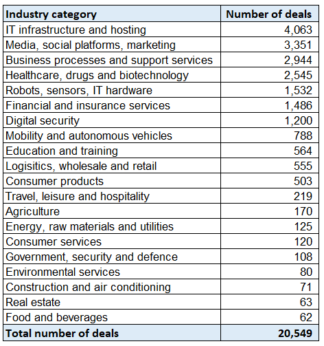
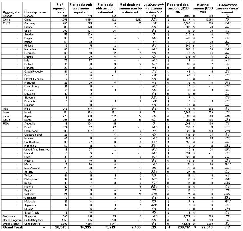
Preqin data was processed and categorised by country and industry. The industry categorisation is based on grouping 228 Preqin industry labels into 20 broader categories. The full list of industry categories with the number of deals corresponding to each category is presented in (Figure 9.1).
Figure 9.1. List of industry categories with number of deals from 2012-2020
Many of the reported investment transactions (deals) from 2012 through 2020 do not include the amount invested, e.g. 18% of the deals for US start-ups and 63% for Chinese start-ups. Where possible, an estimate of missing amounts was calculated based on the median amount of comparable clusters of deals per country of the start-up, investment year and investment stage. The impact of estimating amounts for which the amount is missing increases the total value of VC investments by 7% between 2012 and 2020, with an increase of 5% for US-based start-ups and 11% for start-ups based in China over the period (Figure 9.2).
When considering the origin of the financing, about 16% of deals have no investor identified. The estimates prorate the value of those deals to the different countries in the sample following the distribution of deals with reported investors.
When a single round of financing includes multiple investors, Preqin data does not specify how much each investor has contributed. For such deals, the invested value is split equally between investors.
For more information and findings about venture capital investments in AI start-ups, please see OECD (2021).
Figure 9.2. Impact of estimating amounts relative to amounts reported per country
VC deals with AI firms from 2012 to 2020; excluding countries with less than 5 reported deals
10 AI-powered COVID-19 Watch
OECD.AI’s AI-powered COVID-19 tracker provides up to date information and news about the coronavirus. Interactive visualisations are made available to policy makers and other users to help them track and compare the evolution of the pandemic between countries.
The tracker’s main dashboard consists of two panels (Figure 10.1). The left-hand panel contains a table where is country is paired with up-to-date national COVID-19 statistics, including infections, deaths, and recoveries. Dynamic visualisations are accessible through the different tabs available in the right-hand panel. For each tab, it is possible to compare the evolution of the pandemic in a selection of countries by clicking on them in the left-hand panel.
Figure 10.1. AI-powered COVID-19 tracker
Sample dashboard illustration :
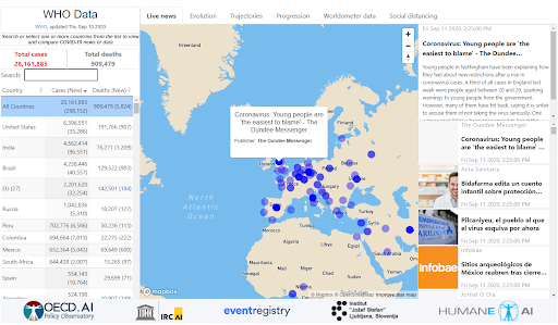
Live News tab
The first tab displays live COVID-19-related news from around the world. The feed comes from Event Registry (see Event Registry data) and uses “COVID-19” and “Coronavirus” as the two keywords upon which news are selected. Country-specific views are available by selecting a country from the list.
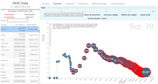
Evolution tab
This visualisation displays the evolution of the pandemic though five dimensions: the number of infections (x-axis); the growth rate of infections (y-axis) (the growth rate of infections is estimated using an exponential regression model based on the number of infections in the previous 7 days); the number of deaths (bubble size); the region (bubble colour); and the date (timeline).
In addition, a red ring around the country’s bubble indicates the date when the first COVID-19 death was reported.
By checking the “Switch deaths/cases” box, the user can swap the x and y-axes to display the curve of deaths instead of infections. The “Cases per capita” and the “Deaths per capita” checkboxes allow the user to normalise the numbers per unit of population.
To spread the long tail of the distribution and thus allow for a more intuitive visualisation, the square root of the x-axis is set as the default option ( xx). However, a checkbox makes it possible to display the data in linear scale.
When a specific country is selected from the list, the country-tracking mode is enabled (Figure 10.2). While still displayed, all other countries are shaded and a trail is drawn for the country of interest. The user can decide to “Hide other countries” and/or “Hide trace” by clicking on the relevant buttons. The user can select multiple countries from the list by holding the Ctrl key down.
Figure 10.2. COVID-19 “Evolution” tab
Sample illustration of the evolution of the pandemic in the EU27 23
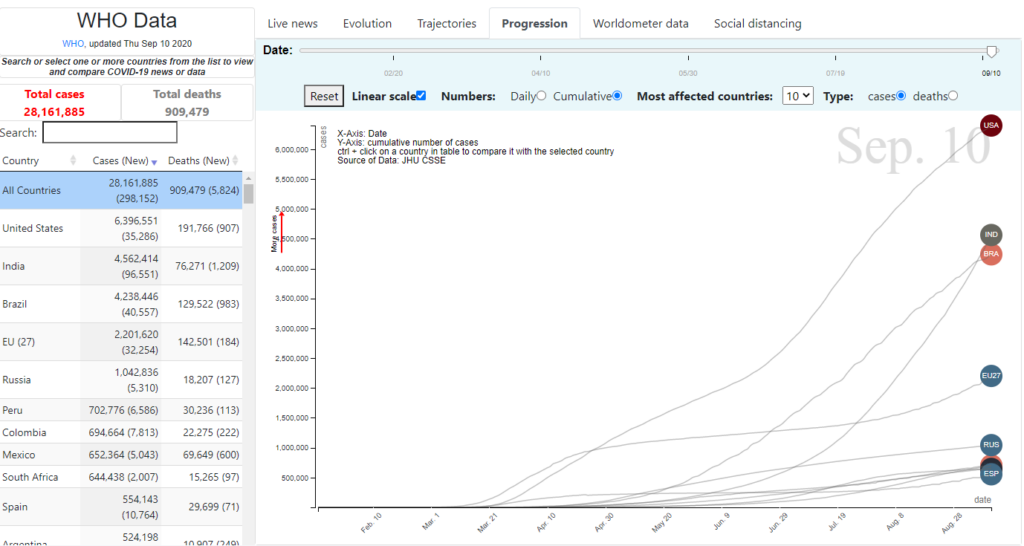
Progression tab
This line chart displays the number of infections or deaths – either the daily amounts or the cumulative number from the start of the pandemic – by country and in time. Although the default x-axis scale is linear, the user has the option to change it to logarithmic to better visualise countries with large differences in value. The top 10 countries by the number of infections or deaths are shown by default, which could be customised by selecting different countries from the list (Figure 10.3).
Figure 10.3. COVID-19 “Progression” tab
Sample illustration of the progression of the top 10 countries by number of infections or deaths

Trajectory tab
While the “Progress” tab displays the number of infections or deaths in chronological order, the “Trajectory” tab sets a unique starting point for all countries as the base for comparison. Here, the x-axis measures the number of days after a given country reached 100 infections. The goal is to allow for fairer comparisons of different countries’ trajectories, as if they all started fighting the pandemic on the same day. The starting point has been arbitrarily set to 100 infections as an indication of COVID-19 spread capacity in a given country. As for the “Progression” tab, the scale of the x-axis could be switched to logarithmic and the country selection can be customised by selecting different countries from the list (Figure 10.4).
Figure 10.4. COVID-19 “Trajectories” tab
Sample illustration of the trajectories of the top 10 countries by number of infections or deaths
Worldometer data tab
This tab presents a table with live COVID-19 statistics, including infections, deaths, recoveries, and tests. The data are retrieved from Worldometer and are updated several times per day.
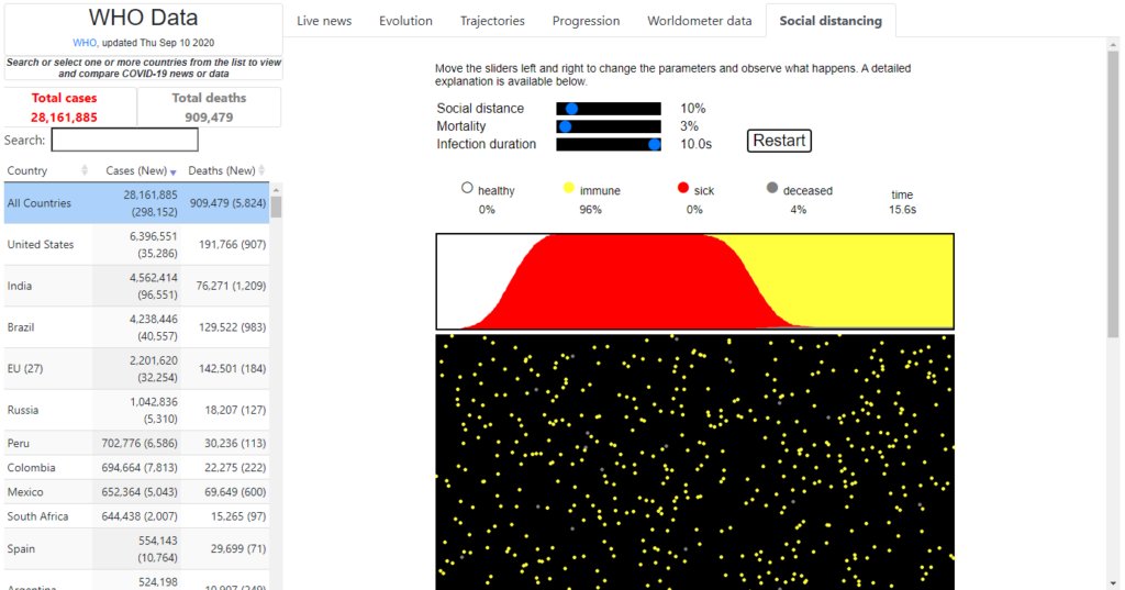
Social distancing tab
This interactive simulator allows the user to explore the effects of social distancing on the spread of a contagious disease (Figure 10.5). The simulation runs on three parameters:
- Social distancing: controls to what extent the population enforces social distancing. It goes from 0% (no social distancing) to 100% (no physical contacts).
- Mortality: probability that an infected person dies. It goes from 0% (no letality) to 100% (everyone infected dies).
- Infection duration: indicates the average length of infection. It goes from 0 seconds (instantaneous recovery) to 10 seconds (lengthiest recovery). Since the simulation runs at high speed, infection duration is measured in seconds.
Each dot represents a person who can be either healthy (white), immune (yellow), infected (red), or deceased (gray). The virus is transmitted by collisions between dots. After a period of infection, a person either dies or becomes permanently immune.
The purpose of the simulator is purely educational, as it uses a mathematical model to demonstrate the complexity of social distancing during an epidemic.
Figure 10.5. COVID-19 “Social distancing” tab
Sample illustration of a social distancing simulation
Data Sources
Except for the Worldometer data tab – which retrieves its data directly from Worldometer – the AI-powered COVID-19 watch on OECD.AI uses official data from the World Health Organization (WHO), which is retrieved daily from the John Hopkins University’s GitHub repository. This is the data repository used for the 2019 novel coronavirus visual dashboard operated by the Johns Hopkins University Center for Systems Science and Engineering (JHU CSSE).
11 References
- Brank, J.; Leban, G.; and Grobelnik, M. (2017). Annotating Documents with Relevant Wikipedia Concepts. Proceedings of the Slovenian Conference on Data Mining and Data Warehouses (SiKDD 2017), Ljubljana, Slovenia, 9 October 2017. http://ailab.ijs.si/dunja/SiKDD2017/Papers/Brank_Wikifier.pdf
- Breitinger, C.; Gipp, B.; and Langer, S. (2015), Research-paper recommender systems: a literature survey, International Journal on Digital Libraries, 17 (4): 305–338, https://dx.doi.org/10.1007/s00799-015-0156-0. ISSN 1432-5012.
- Cao, J.; Tian, X.; Jintao, L.; Yongdong, Z.; and Sheng, T. (2009). A density-based method for adaptive lda model selection. Neurocomputing – 16th European Symposium on Artificial Neural Networks 2008 72, 7–9: 1775–1781. http://doi.org/10.1016/j.neucom.2008.06.011
- Deveaud, R.; SanJuan, E.; and Bellot, P. (2014). Accurate and effective latent concept modeling for ad hoc information retrieval. Document numérique 17, 1: 61–84. http://doi.org/10.3166/dn.17.1.61-84
- Gonzalez, D.; Zimmermann, T.; and Nagappan, N. (2020). The State of the ML-universe: 10 Years of Artificial Intelligence & Machine Learning Software Development on GitHub. In 17th International Conference on Mining Software Repositories (MSR ’20), October 5–6, 2020, Seoul, Republic of Korea. ACM, New York, NY, USA, 12 pages. https://doi.org/10.1145/3379597.3387473
- Griffiths, T.; and Steyvers, M. (2004). Finding scientific topics. Proceedings of the National Academy of Sciences 101, suppl 1: 5228–5235. http://doi.org/10.1073/pnas.0307752101
- OECD (2021), Venture Capital Investments in Artificial Intelligence: Analysing trends in VC in AI companies from 2012 through 2020. OECD Publishing, Paris.
- OECD (2019a), Recommendation of the Council on Artificial Intelligence, OECD/LEGAL/0449, https://legalinstruments.oecd.org/en/instruments/OECD-LEGAL-0449.
- OECD (2019b), Revised outline for practical guidance for the Recommendation of the Council on Artificial Intelligence, https://one.oecd.org/document/DSTI/CDEP(2019)4/REV2/en.
- OECD and SCImago Research Group (CSIC) (2016), Compendium of Bibliometric Science Indicators, OECD Publishing, Paris, http://oe.cd/scientometrics.
- OECD (2009), OECD Patent Statistics Manual, OECD Publishing, Paris, https://doi.org/10.1787/9789264056442-en
- Rajaraman, A. and Ullman, J. (2011), Mining of Massive Datasets, pp. 1–17, https://doi.org/10.1017%2FCBO9781139058452.002, ISBN 978-1-139-05845-2.
- Rajkumar, A.; Suresh, V.; Veni Madhavan, C.; and Narasimha, M. (2010). On finding the natural number of topics with latent dirichlet allocation: Some observations. In Advances in knowledge discovery and data mining, Mohammed J. Zaki, Jeffrey Xu Yu, Balaraman Ravindran and Vikram Pudi (eds.). Springer Berlin Heidelberg, 391–402. http://doi.org/10.1007/978-3-642-13657-3_43
- Settles, B. (2010), Active Learning Literature Survey, Computer Sciences Technical Report 1648, University of Wisconsin–Madison, http://burrsettles.com/pub/settles.activelearning.pdf.
- Shen, Z.; Ma, H.; and Wang, K. (2018), A Web-scale system for scientific knowledge exploration, arXiv, https://arxiv.org/abs/1805.12216.
- Sinha, A.; Shen, Z.; Song, Y.; Ma, H.; Eide, D.; Hsu, B.; and Wang, K. (2015), An Overview of Microsoft Academic Service (MAS) and Applications. In Proceedings of the 24th International Conference on World Wide Web (WWW ’15 Companion). ACM, New York, NY, USA, 243-246. DOI: http://dx.doi.org/10.1145/2740908.2742839.
- Wang, K.; Shen, Z.; Huang, C.; Wu, C.; Eide, D.; Dong, Y.; Qian, J.; Kanakia, A.; Chen, A.; and Rogahn, R. (2019), A Review of Microsoft Academic Services for Science of Science Studies, Frontiers in Big Data, https://doi.org/10.3389/fdata.2019.00045.
- Wu, Y.; Schuster, M.; Chen, Z.; Le, Q.; Norouzi, M.; Macherey, W.; Krikun, M.; Cao, Y.; Gao, Q.; Macherey, K. et al. (2016). Google’s neural machine translation system: Bridging the gap between human and machine translation. arXiv preprint arXiv:1609.08144, 2016.
- Zhu, T.; Fritzler, A.; and Orlowski, J. (2018). World Bank Group-LinkedIn Data Insights: Jobs, Skills and Migration Trends Methodology and Validation Results (English). Washington, D.C.: World Bank Group. http://documents.worldbank.org/curated/en/827991542143093021/World-Bank-Group-LinkedIn-Data-Insights-Jobs-Skills-and-Migration-Trends-Methodology-and-Validation-Results.